Making the internet slightly less awful.
BRAND STRATEGY // VISUAL IDENTITY // LOGO DESIGN

Constructing a World-Class Identity

A complete brand overhaul for THEROCK Construct Ltd. to align their visual identity with their global ambitions.

CLIENT

TheRock Construct Ltd.

INDUSTRY

Construction & Engineering

CAPABILITIES

Brand Strategy, Visual Identity Design

The Challenge

Modernizing a Legacy Brand for a Global Stage.

THEROCK Construct Ltd. is a company with a vision to deliver world-class projects and achieve a competitive edge on a global stage. However, their existing brand identity was dated and did not reflect their high standards or lofty ambitions. The challenge was to completely overhaul the brand, creating a modern and premium identity that communicated their core values of Stability, Durability, and Resilience and could stand confidently alongside international competitors.

https://grumpydzynrz.com/wp-content/uploads/2025/08/the-rock-construct-ltd-logo-sketched-on-a-sketchpad.png
https://grumpydzynrz.com/wp-content/uploads/2025/08/therock-construct-ltd-logo-engraved-on-a-rock.png
https://grumpydzynrz.com/wp-content/uploads/2025/08/therock-construct-ltd-branded-vehicle.png
https://grumpydzynrz.com/wp-content/uploads/2025/08/escavator.png
/ Abstract Strength and Precision.

Our Strategic Approach: Brand Modernization

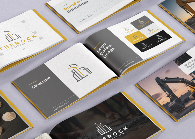
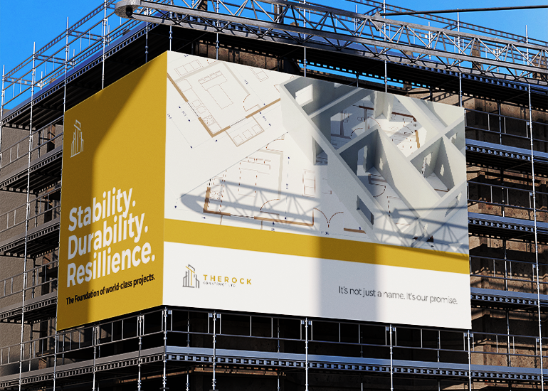
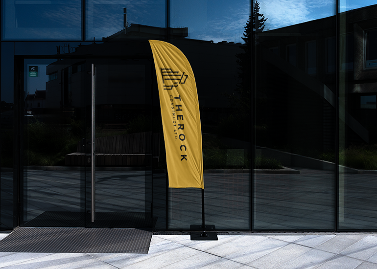
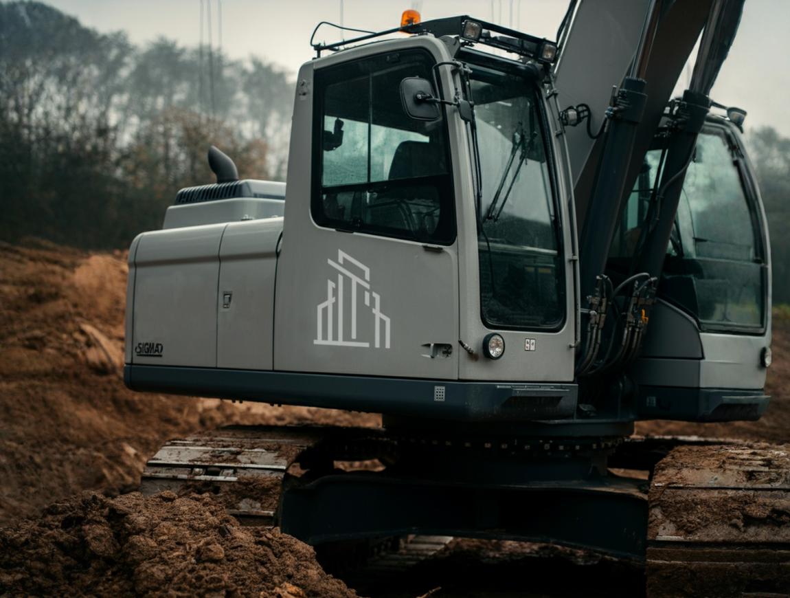
Our strategy was to move away from literal representations and create a sophisticated, abstract mark. We designed a logo that evokes a cluster of modern buildings, with a central golden pillar forming a subtle "T" to honor the client's request to emphasize "THEROCK." The color palette was refined to a professional Gold (#D29F2A) and Charcoal (#606161), elevating the brand's feel to match their premium services. This was paired with a strong, modern typographic system led by Montserrat and Lato to ensure clarity and confidence across all communications.

The Outcome

An Identity as Strong as The Rock Itself.

We delivered a comprehensive brand identity system captured in a detailed brand book, ensuring consistency across all future applications. The final brand is clean, modern, and uncluttered, giving THEROCK the premium appeal required to compete on a global stage. The new identity provides a powerful foundation, accurately reflecting the strength, stability, and world-class quality of their work.

http://A%20billboard%20on%20a%20building%20under%20construction%20displaying%20the%20words%20'Stability.%20Durability.%20Resilience.,'%20symbolizing%20the%20foundational%20brand%20strategy%20required%20for%20a%20business%20comeback.

Have a Similar Challenge?

We solve complex branding and digital problems with clarity and conviction. If you're ready for a real solution, we're ready to listen.